Contents
Case Study | Logo Process | Stationery | Website | Advertisement | Annual Report
Case Study
Overview
Abbotsford International Airport (YXX) is located in Abbotsford, British Columbia, and is the second largest airport in the Lower Mainland. The airport was completed in 1943, and is mainly used for general aviation as well as an alternate field to Vancouver International Airport (YVR) for landing. YXX plays a key role in the aviation and aerospace community in Abbotsford and is the host for the Abbotsford International Airshow every year.
Current Branding & Marketing Position
YXX’s current branding is in line with the outlook of the city, which focuses heavily on the economic growth and development of Abbotsford and the Fraser Valley. The airport’s lack of focus on tourism, however, results in a rather dull and monotonous visual identity. Nonetheless, as one of Abbotsford’s major assets, YXX is reputed amongst airlines as an airport that is easy to work with and capable of operating under low costs. Their current market includes visitors and residents in the Fraser Valley which is about an hour east of Vancouver, making it a good alternative to competitors like YVR.
Challenges & Opportunities
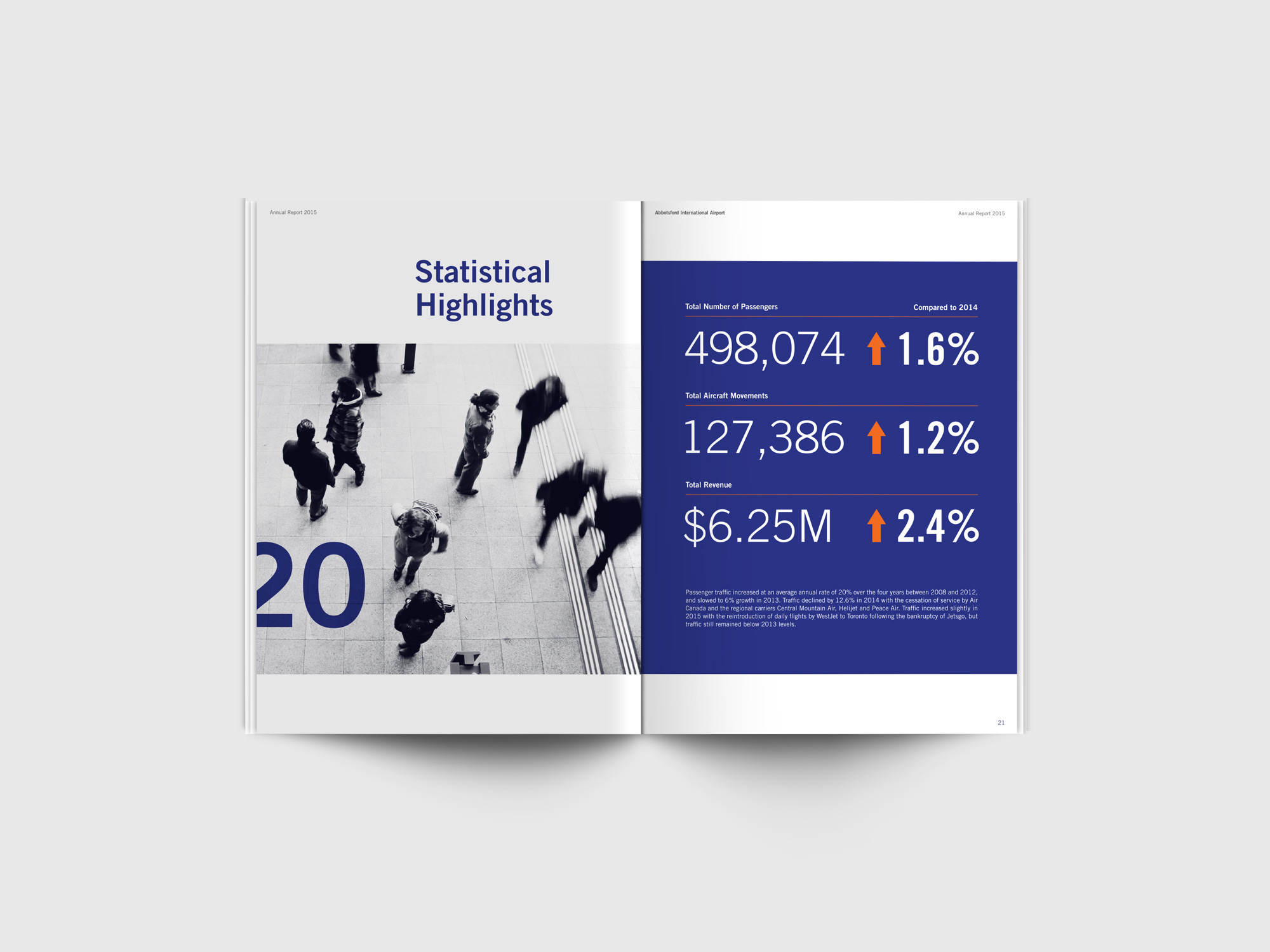
YXX is a great airport for locals, as it is easy and efficient to get in and out of due to its small size. However, it lacks a sense of place and does not live up to its name as an international airport. As statistics have shown that the number of passengers passing through YXX has decreased over the last 10 years, the airport has a potential to boost this number up by rebranding and establishing a distinctive visual identity that can help make the brand memorable to its international visitors.
Solution
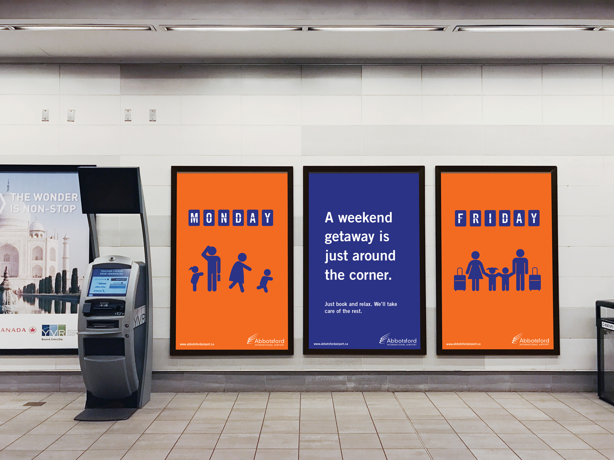
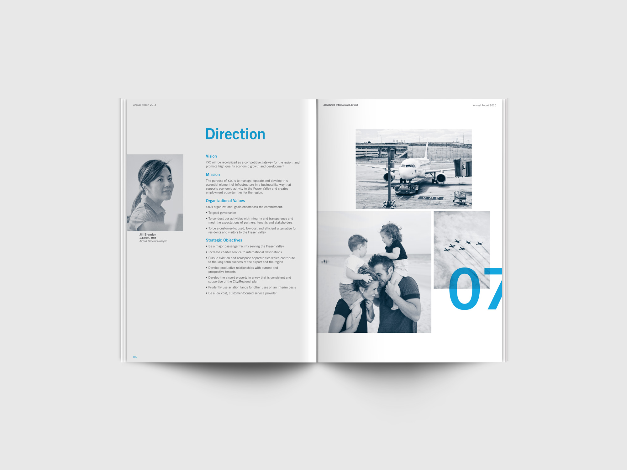
One of the most important steps in rebranding YXX is to first identity the right target audience. Families with kids and seniors would be the ideal target market for YXX as it is much easier for them to travel within a small airport. With this target market in mind, the goal is to convey that YXX is a compact and efficient alternative that provides families with the ease of travelling in a friendly airport environment.
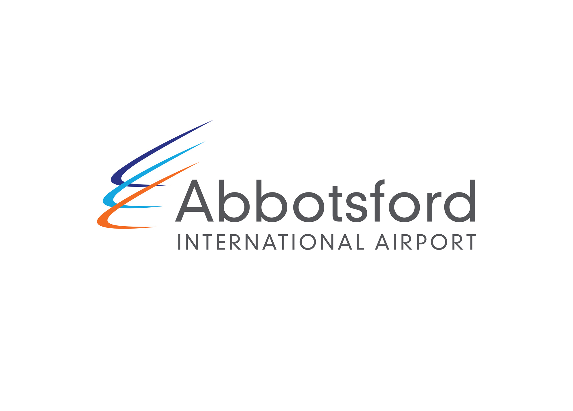
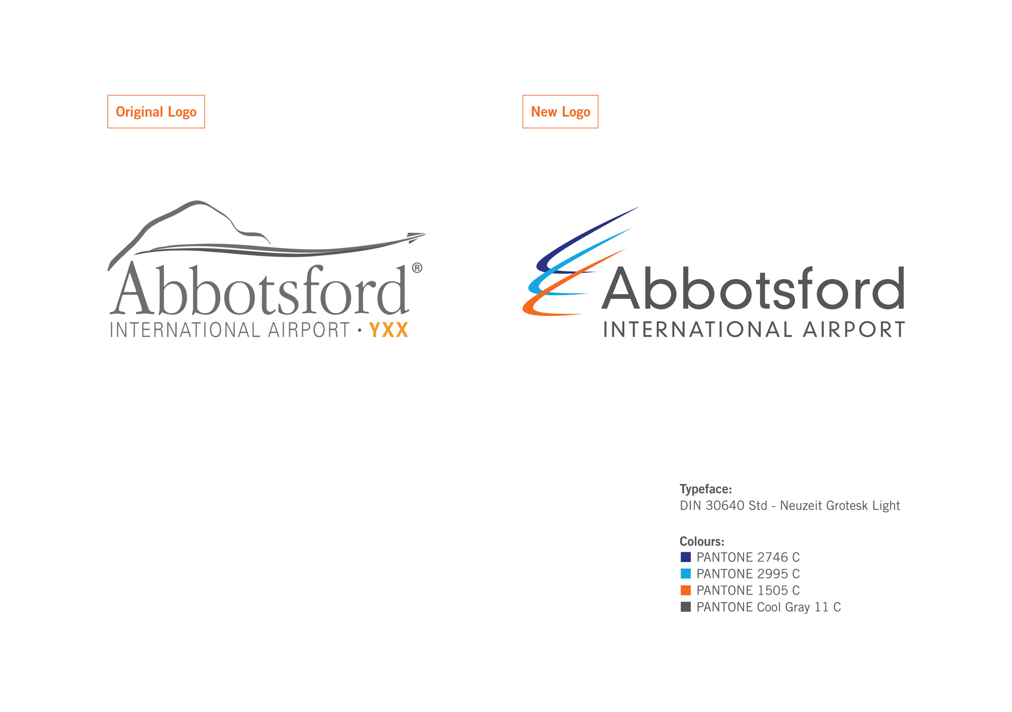
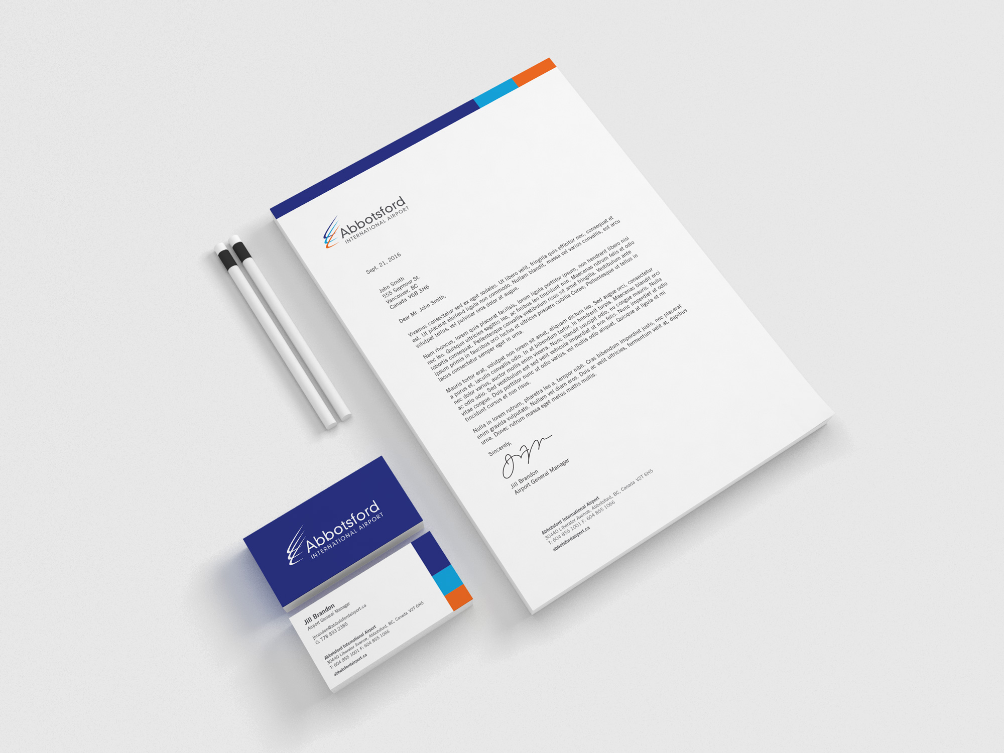
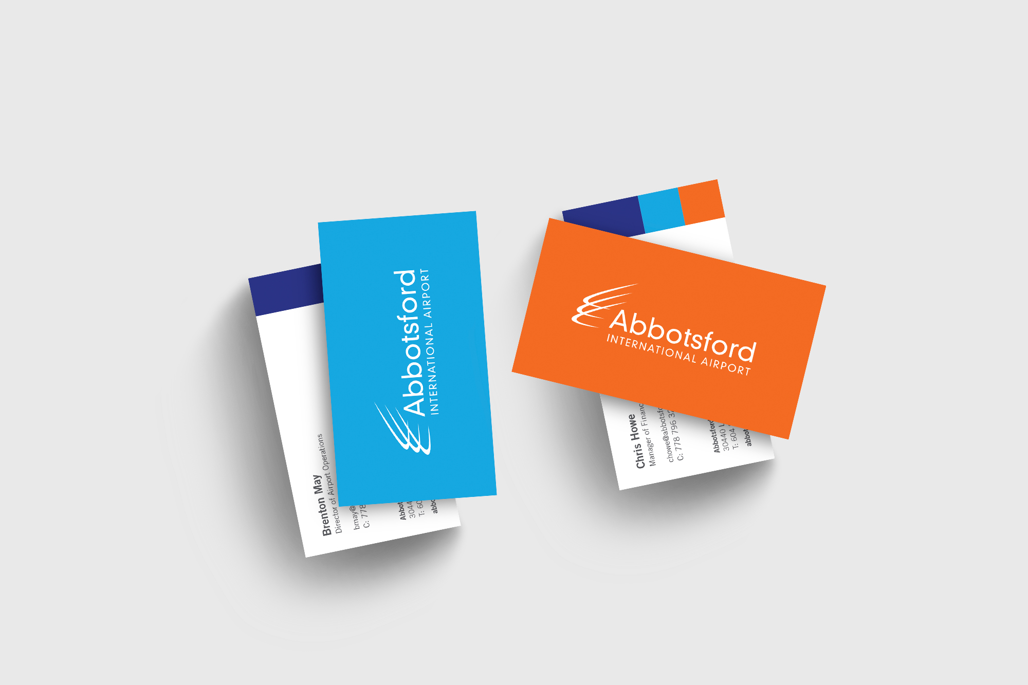
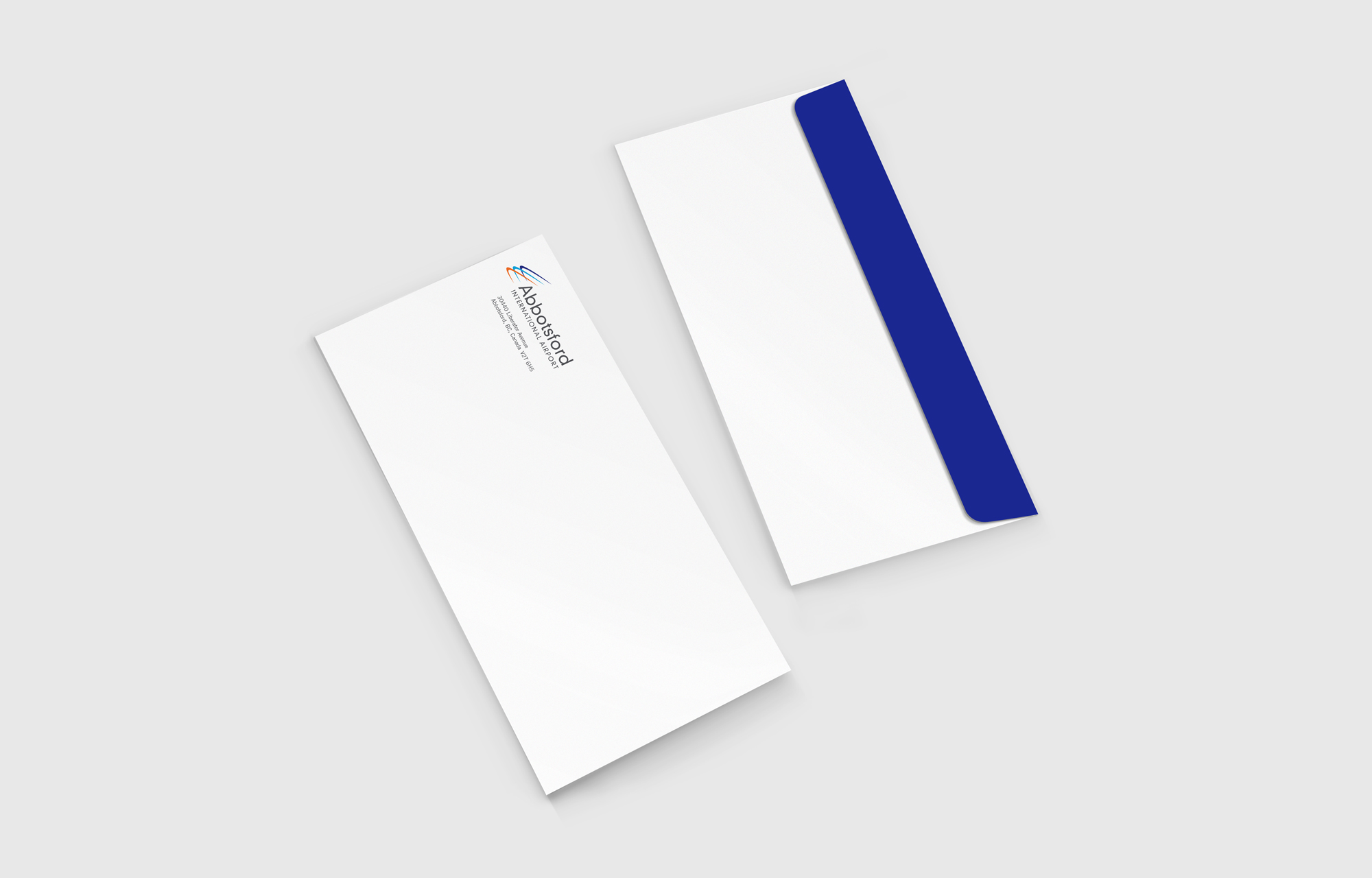
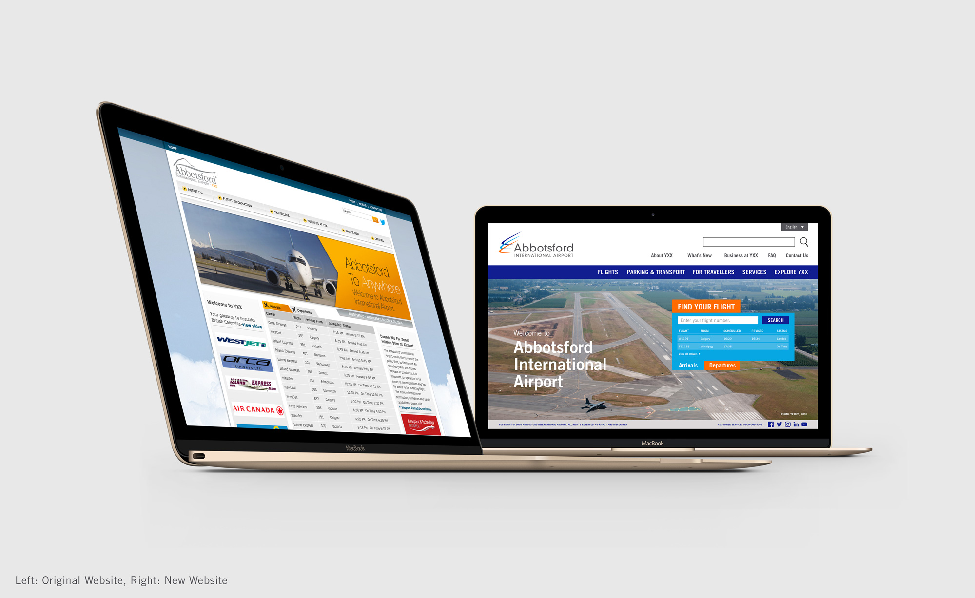
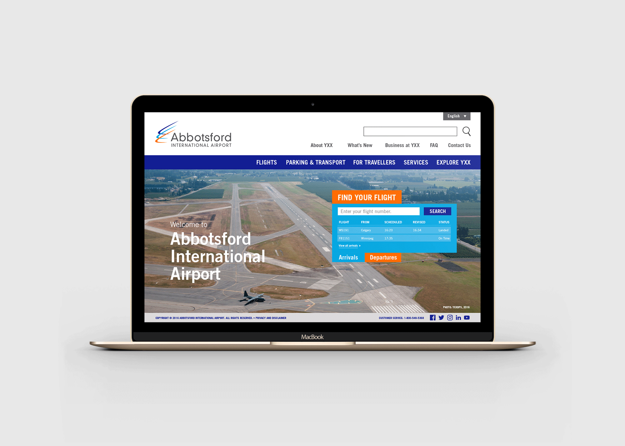
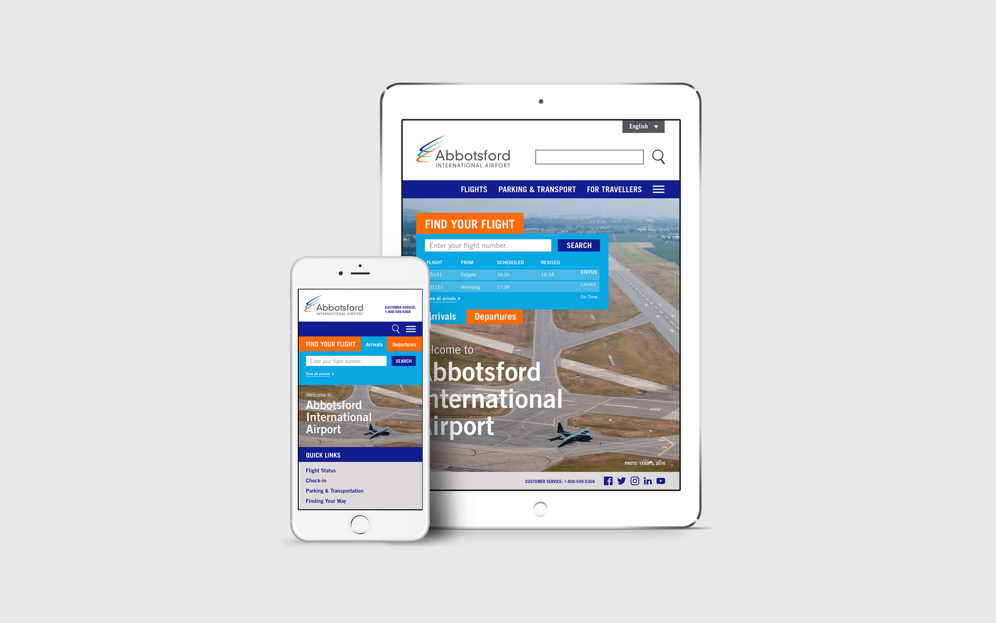
Another key part in rebranding YXX is to create a brand new visual identity that helps reinforce the brand’s image in the target audience. For this project, three visual words were used to help rebrand YXX: simple, warm and contemporary. A new set of colours, blues and oranges, as well as two sans-serif typefaces, DIN 30640 Neuzeit Grotesk Light for the logo and Trade Gothic for all body copy, were used to project a more contemporary appeal for the airport. Furthermore, photography images of families are incorporated as part of YXX’s visual style in order to provide a sense of familiarity for the target audience.
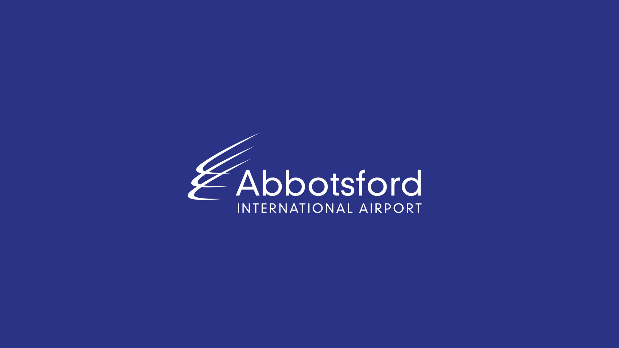
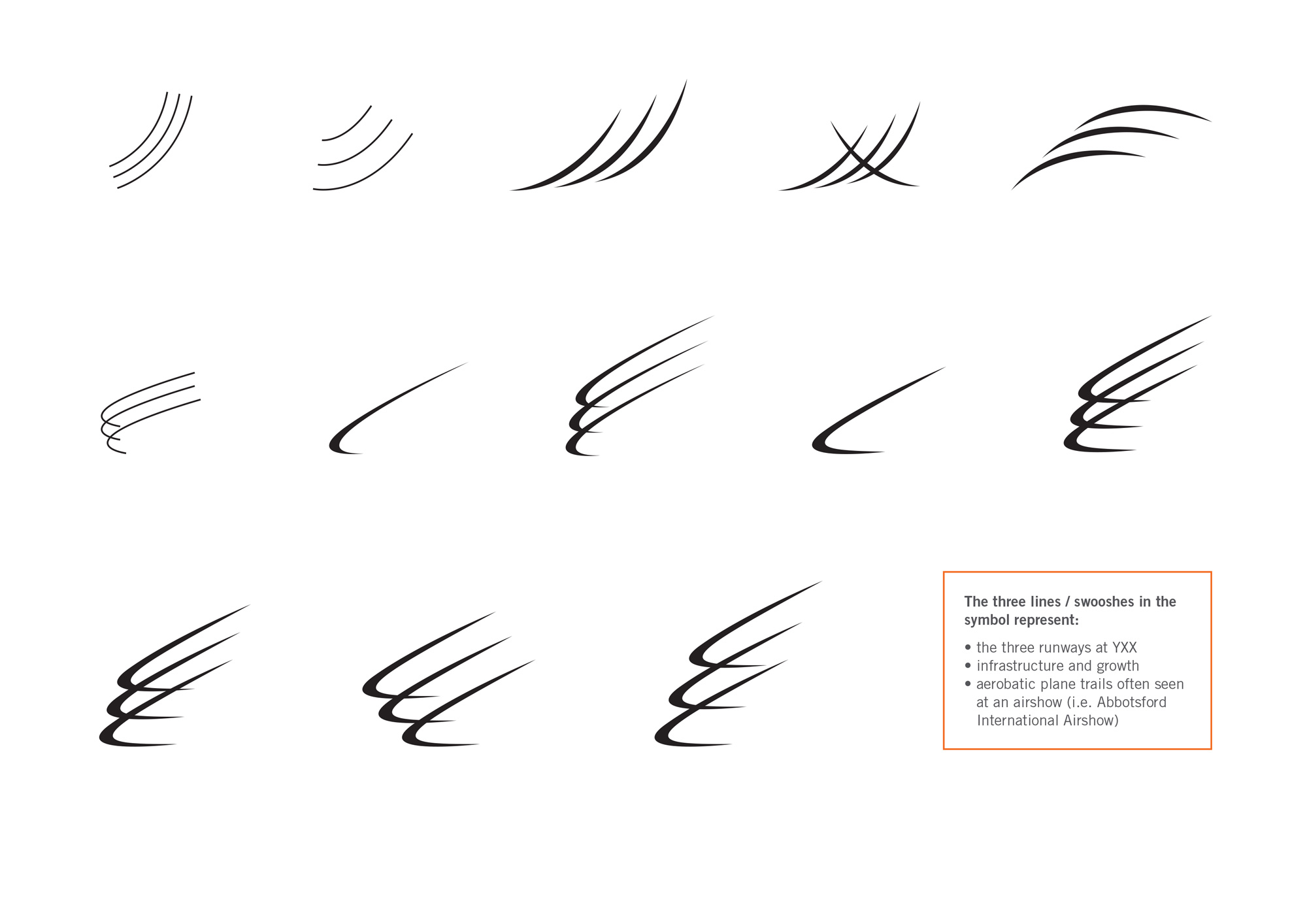
YXX’s new visual identity will be implemented in its new logo, stationery, as well as marketing collaterals such as website, advertisements, and annual reports. YXX’s new logo also consists of a symbol that was inspired by the aerobatic plane trails often seen at an airshow, which visually identifies the airport and its key role in Abbotsford’s aviation and aerospace community.
Results
YXX’s new visual identity will help create a sense of familiarity that draws the attention of its target audience while staying true to its role in the aviation industry. The success of YXX’s rebrand should also result in an annual increase in the number of family-type visitors passing through the airport.
Logo Process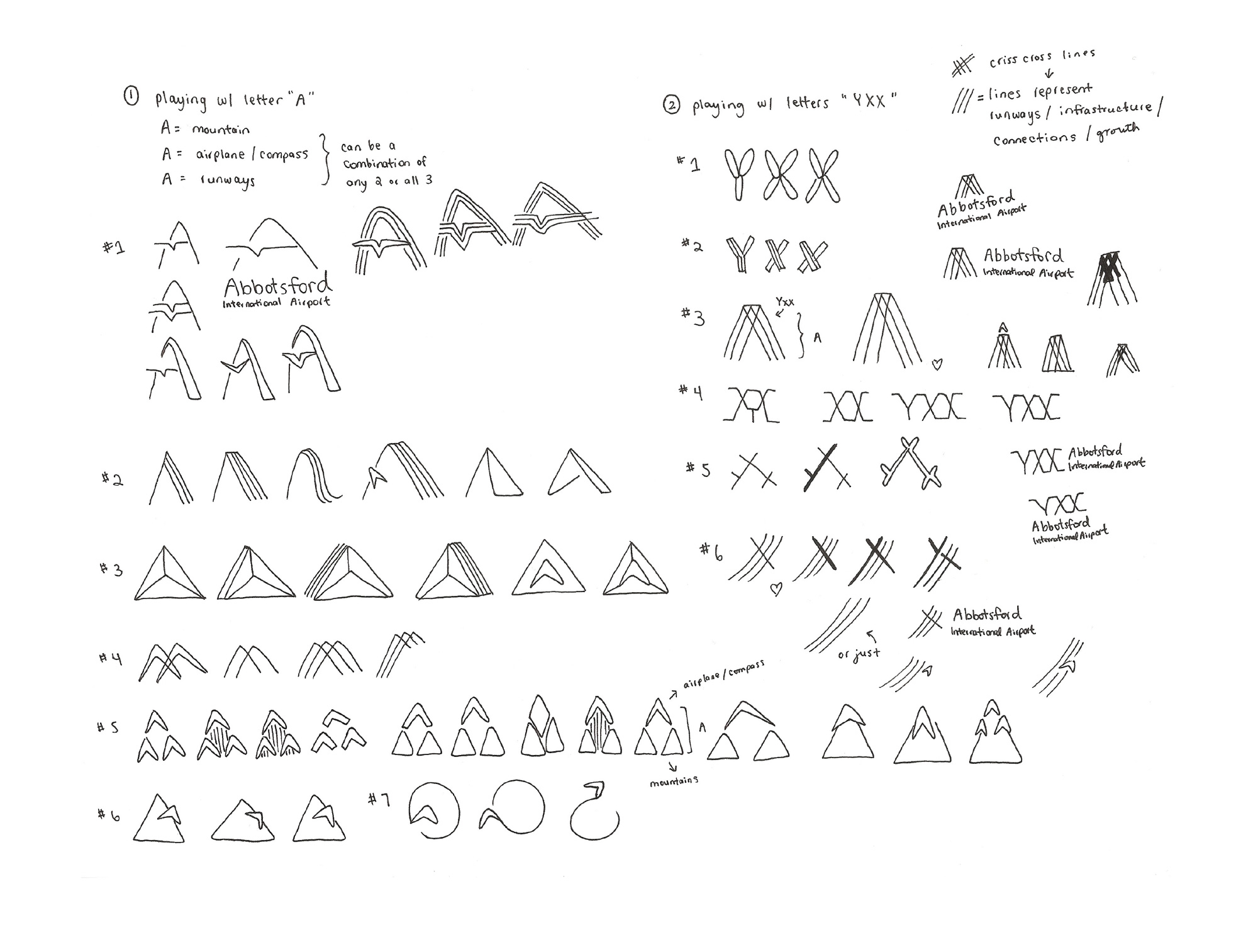
Stationery
Website
Advertisement
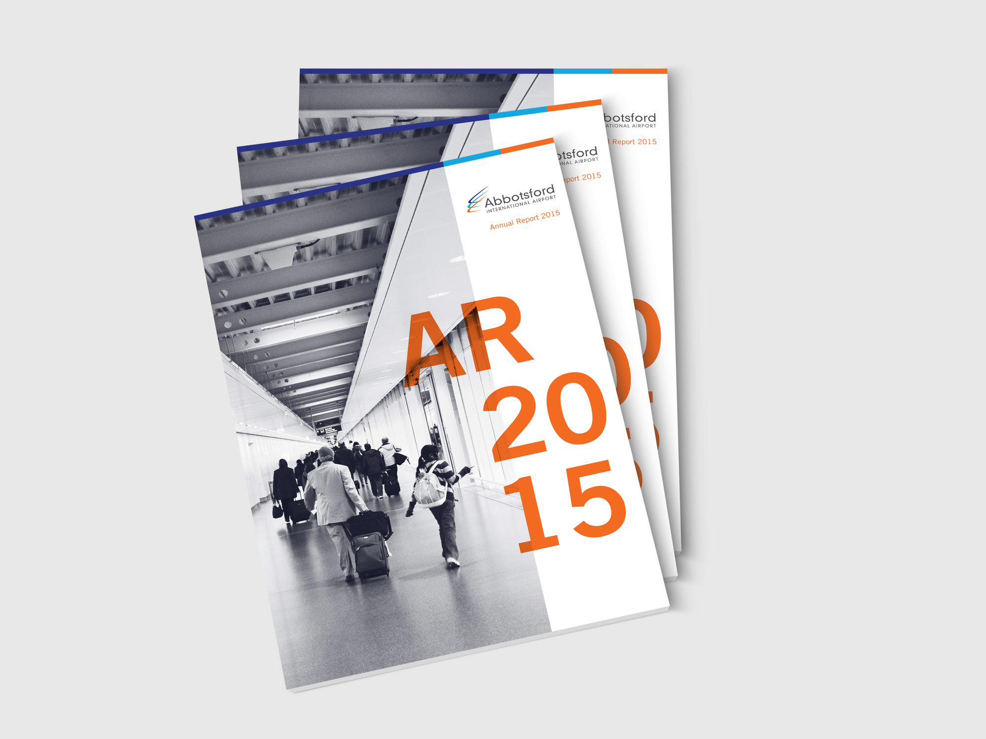
Annual Report

(Note: Written content in the annual report is derived from YXX’s current website and its draft master plan in August 2006.)