Contents
Design Approach | Logo Process | Stationery | Brand Manual
Design Approach
The goal of this project was to develop an identity for the Arbutus Migratory Bird Sanctuary (AMBS), a fictitious non-profit organization that strives to create a world-class sanctuary where birds and their migratory habitats are better understood, valued and protected. (An existing bird sanctuary, the George C. Reifel Migratory Bird Sanctuary, was used as a reference for this project.)
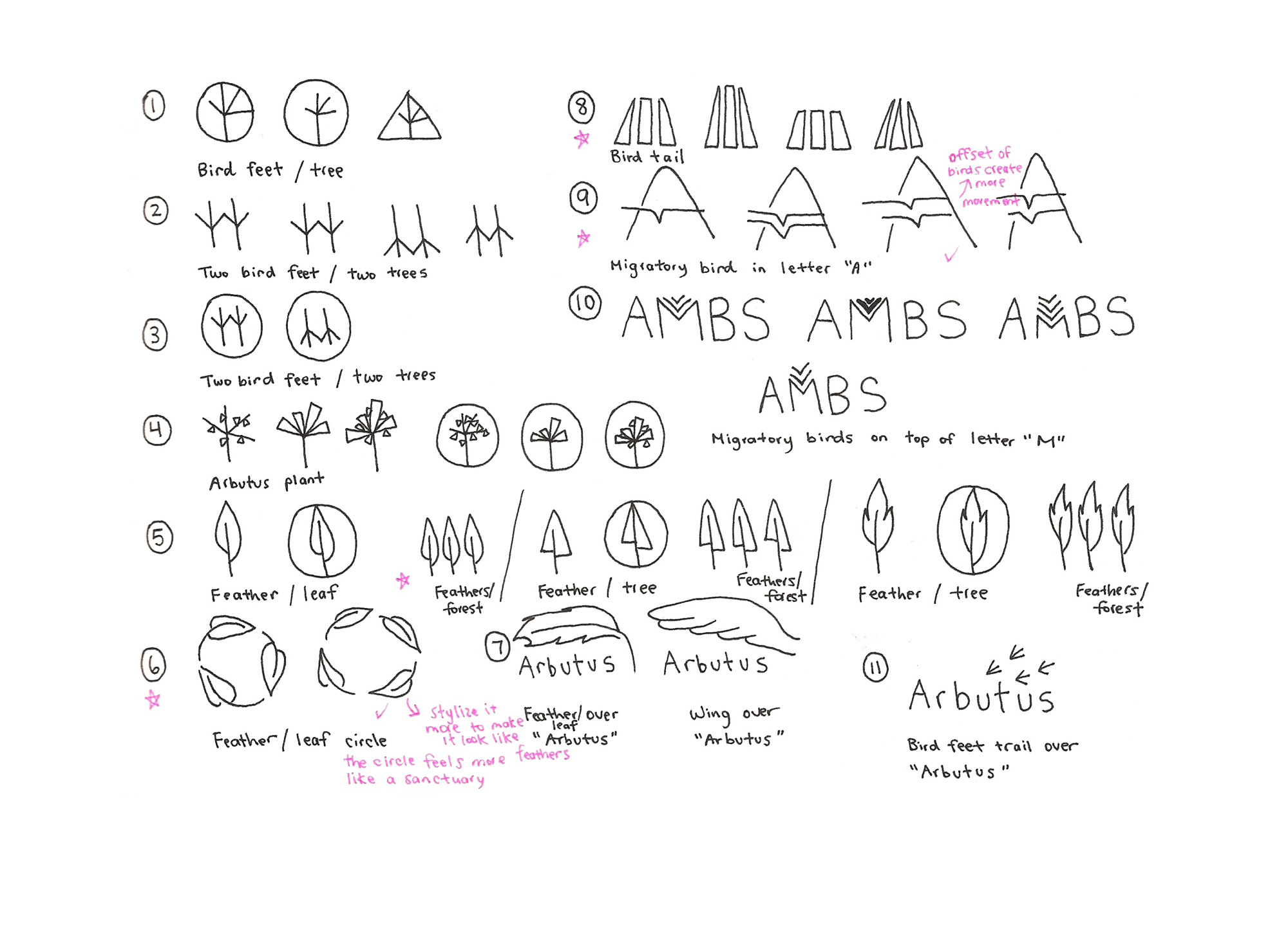
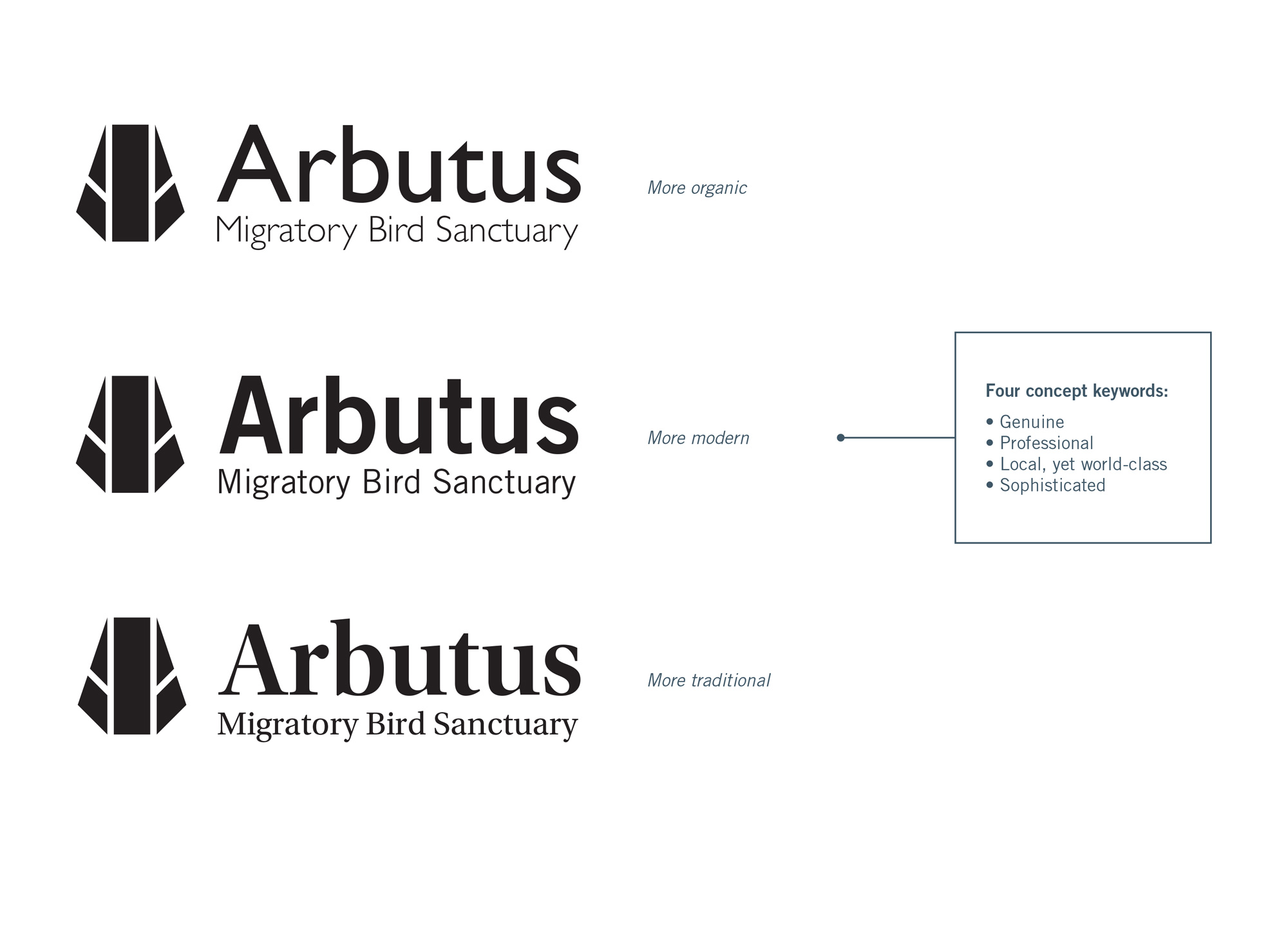
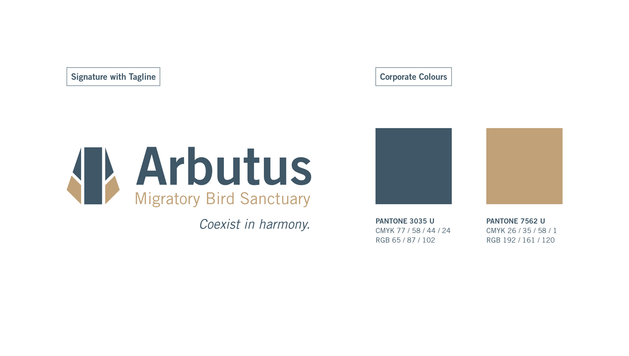
In order to create a visual identity that reflects the vision of AMBS, four concept keywords were used: genuine, professional, local yet world-class, and sophisticated. Taking these qualities into consideration, my approach was to create a logo that is modern and abstract to help emphasize the sanctuary’s refined and and sophisticated quality that makes it a world-class organization. Furthermore, instead of using the entire bird as a symbol for the logo like what many bird sanctuaries have chosen to do, I decided to focus on a specific part of the bird to help visually set AMBS apart from its competitors.
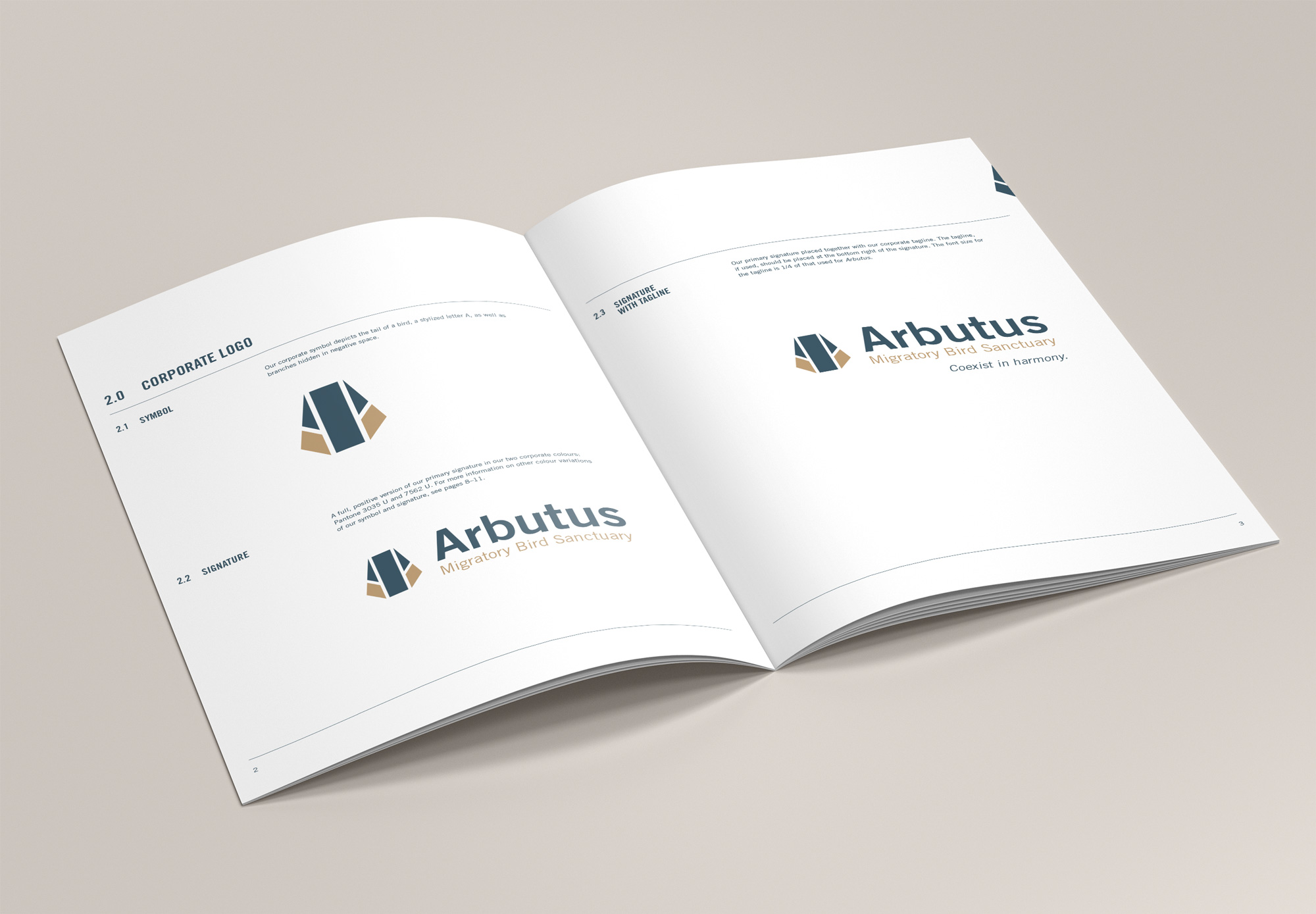
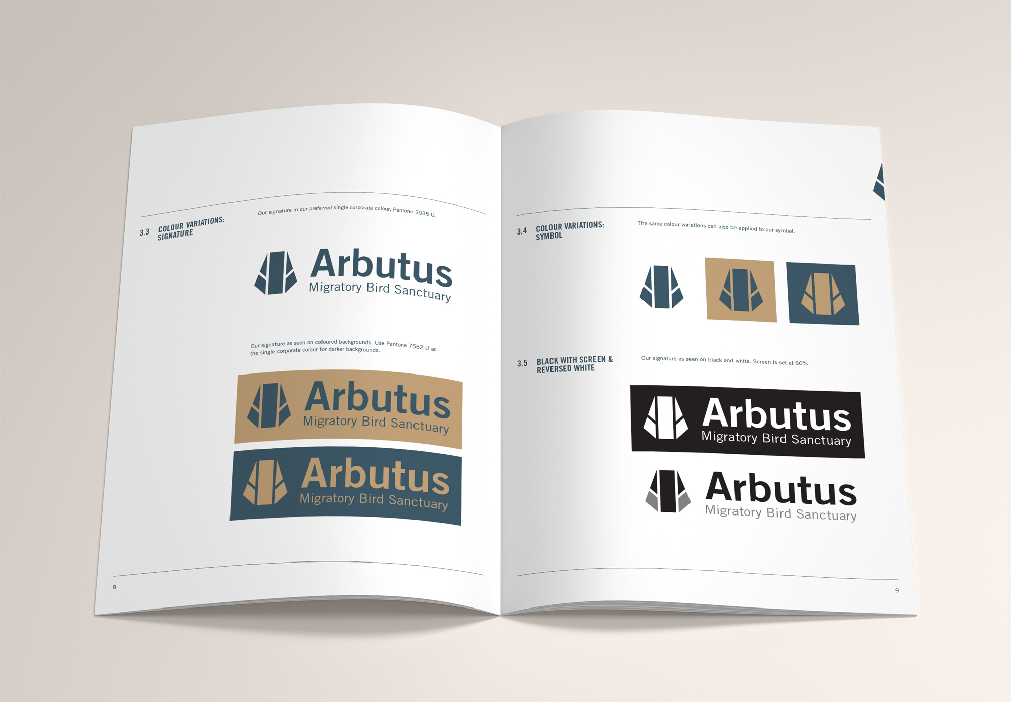
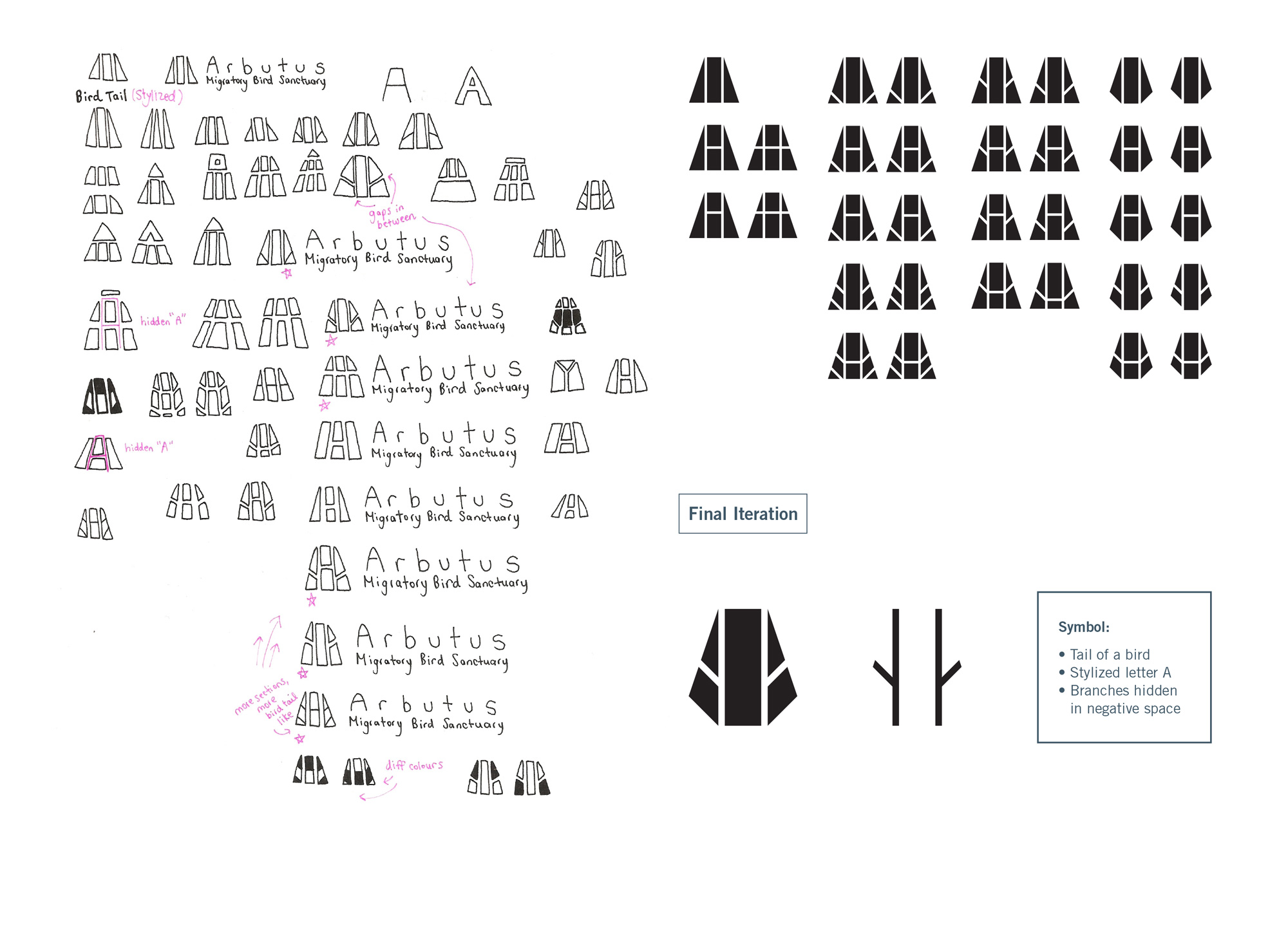
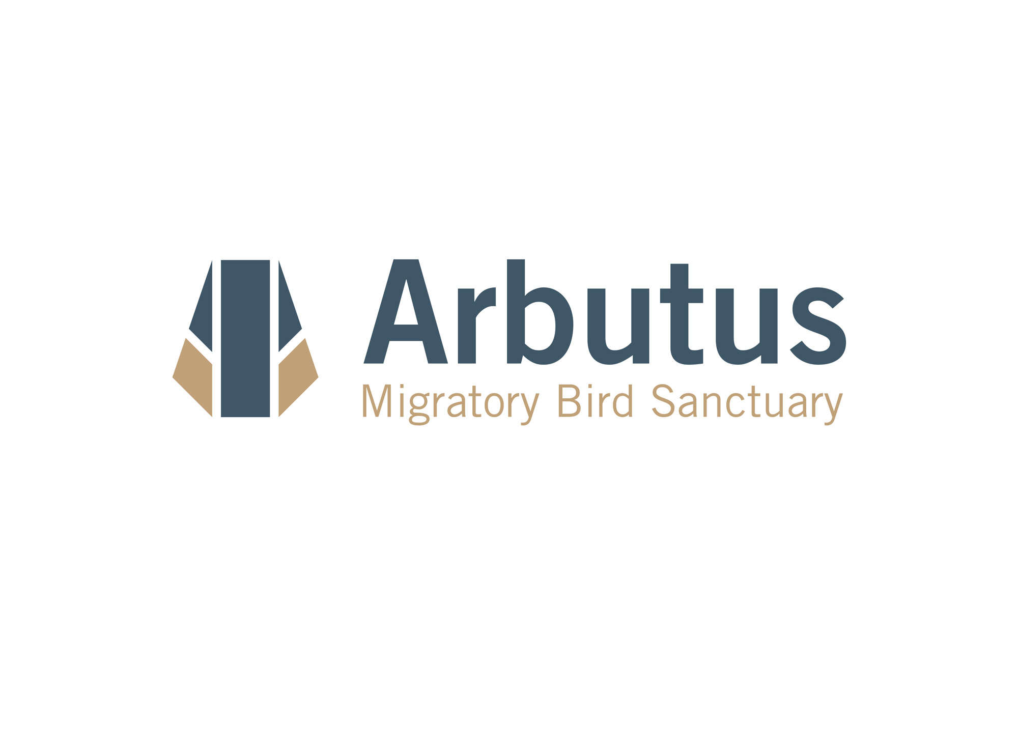
The resulting logo consists of a bold symbol that is based on the tail of a bird as its triangular shape resembles a stylized letter A. Patterns that look like branches were also incorporated into the negative space of the symbol to suggest a sense of place. As for the AMBS name, a san-serif typeface was used to create a more contemporary look. Finally, blue and gold were chosen as the brand’s primary colours to express professionalism and trustworthiness.
Logo Process
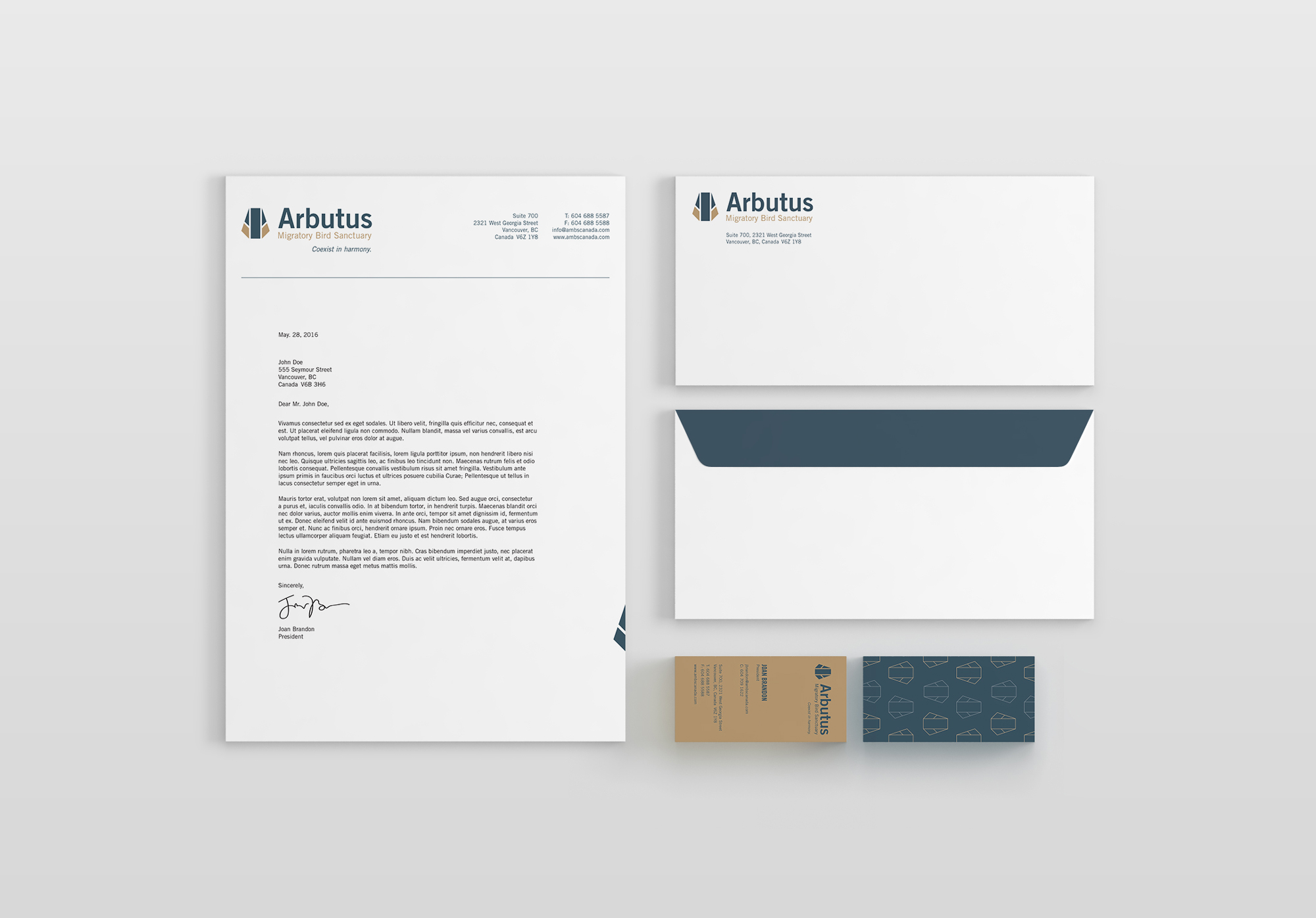
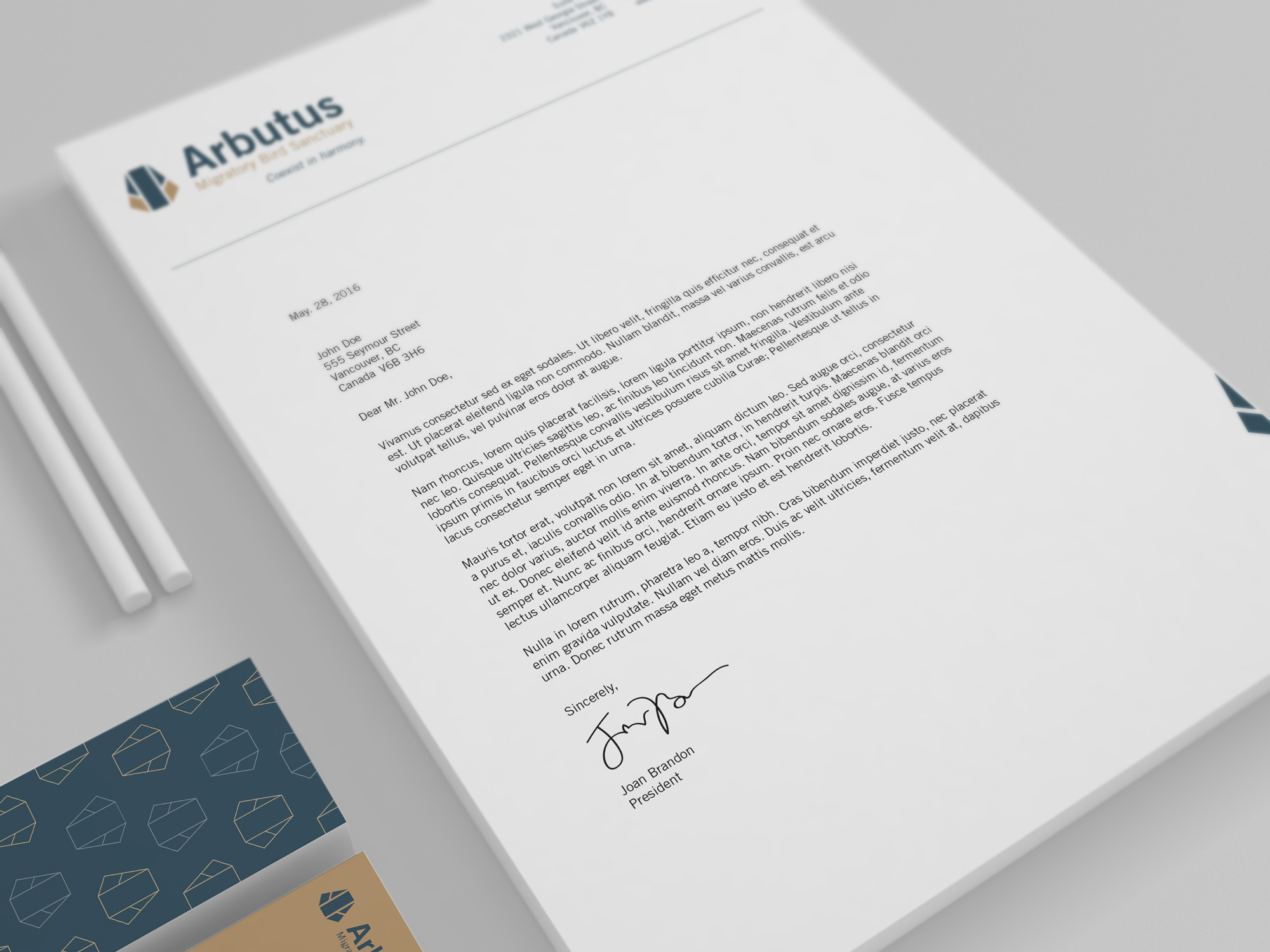
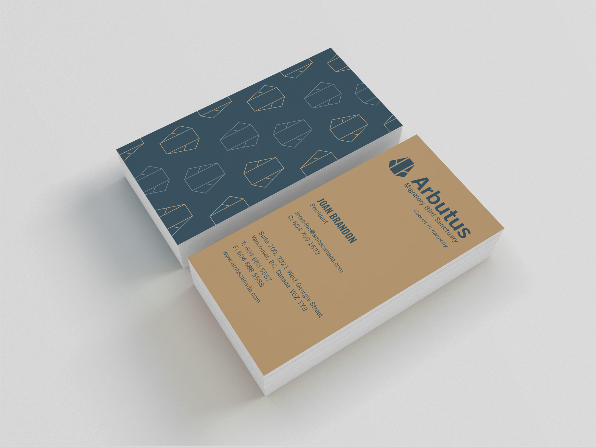
Stationery
Brand Manual